Yep, it’s another list! This time I am talking about my favorite crime fiction book covers of the year. What I am most excited to say is that not only are these all great covers, the words within live up to the hype generated by their covers.
While I deliberately excluded books that made my Top Reads list because you all have already seen those covers and hopefully ordered the books, several of these titles just missed being on that BOLO Books’ Top Reads of 2018 list.
![]()
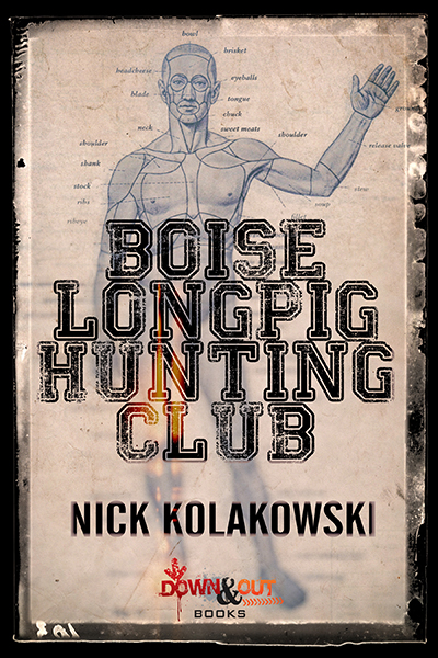
Boise Longpig Hunting Club by Nick Kolakowski
This is a book that still haunts me and the cover has as much to do with that as the text inside. Most readers will know what to expect from the use of the term “longpig” and then that cover image just confirms, but this homage to “The Most Dangerous Game” still manages to surprise. I particularly love the use of the varsity letter-man font for the title and the skillful use of matte/gloss finishes implied in even the online version. Few crime fiction fans would be able to walk past this one with feeling the need to explore further.
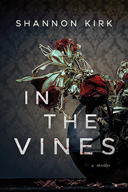
In the Vines by Shannon Kirk
Like many covers, this one is even better when holding the physical book, but you can certainly get the idea from this online reproduction image. The dated wall-paper, the dying roses, the fallen petals, and the brittle feel of the greenery all fit perfectly with the wack-a-doodle Gothic-ness within this mesmerizing novel. The misalignment of the text echoes the structure of the narrative and those subtle splashes of blood confirm that this is most certainly going to be dark story.
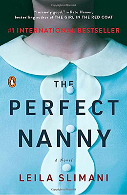
The Perfect Nanny by Leila Slimani
Take a prim and proper blouse and move it ever-so-slightly off-center and you have a near perfect cover. At first glace, this just seem like a typical run-of-the-mill stock photo, but the more you look that more discombobulating it becomes. All the curves and misalignment make you feel out of sorts – which is exactly what the reading experience of this novel is like. You immediately want to know more about who this headless person is, but there is some trepidation about getting too close as well.
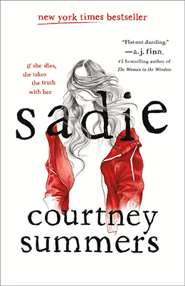
Sadie by Courtney Summers
The hand-drawn quality of this one is just beautiful to behold. Just as the novel is a journey to understand the character, this cover shows the evolution of Sadie from invisible to full-color. The obfuscation of her mouth is intentional, which those who have read the book will understand; and the use of lower-case for her entire name is certainly not an accident. Again, I particularly like the use of the font – this style of typewriter lettering also works well with certain element of the narrative. The textural finish on the physical book itself is also lovely and makes this my favorite cover of the year. sadie is also my prediction to be the winner of next year’s Young Adult Edgar Award.
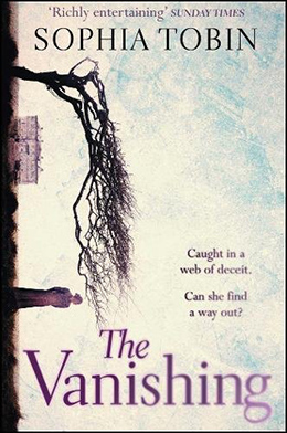
The Vanishing by Sophia Tobin
Anyone who has followed my Top Covers of the Year posts will know, that there is something about turning an image – either sideways or upside-down – that really works for me. Here, the watercolor feeling of this image harkens to the Victorian setting of the novel. The estate in the distance with the menacing tree and the silhouetted woman pretty much guaranteed that I would be reading this book. The fading/blurring at the end of the title linking back to the color at the heart of the silhouetted figure are important elements that will make sense to those who have read this wonderful book.