
From the Booking Desk:
Fans of my blog know that I love a good cover design on a novel. If I had more time, I would certainly talk about many of the ones I love. In 2016, for the first time, I posted about my Top Covers of the year and I will likely do that for future years as well.
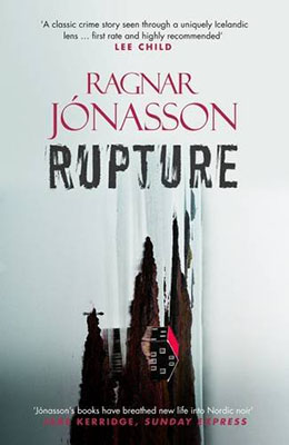
There is little doubt that when it comes time to make the 2017 Top Covers list, Ragnar Jonasson’s Rupture will be on it. Let’s look at this cover a bit closer.
Starting from the top:
You can never go wrong with a pull quote from Lee Child. This one certainly contains key words I can’t disagree with: “classic,” “crime,” “unique(ly),” “Icelandic,” “first rate,” and “recommended.”
Ragnar’s name recognition continues to grow, largely because it has always been placed above the title, alerting fans that this is a must purchase. I love the font and color choice here and the center justification of his first name – smaller – over the larger last name (which itself lines up with the title), is visually appealing.
And then there is that title font. This same font has been used for the entire Dark Iceland Series and it is so effective. The letters have the feel of some type of block printing, where paint coverage is not consistent or perfect. Always in black. Just seeing the title alone, one would know this is a Dark Iceland novel.
Before we get to this stunning image, the bottom pull quote again highlights some important aspects of the books: “Nordic Noir” is a solid description of Ragnar’s writing style. In my review of the first novel, I dubbed Snowblind “cozy noir” because of the dichotomous nature of those two words and I still stand by that categorization.
With Rupture, the cover image is turned sideways. At first glance readers would be forgiven for thinking this was an abstract painting evocative of the novel’s tone. But of course, closer inspection shows that it is a photograph of a building, in some isolated, cold-looking setting (such as the fjord described in the book.) The red roof on the building jumps out among the dark land and crystal blue water. The organic shape of the land-masses and their varying height make for a perfect composition. Finally, the solitary figure standing at the edge of the water draws the reader in and insists that the cover be opened in order to find out what all this means.
And really, isn’t that exactly what we expect from a book cover?
Dark Iceland Reviews:
Snowblind – The BOLO Books Review
Having been a graphic artist somewhere in my young adulthood, I always take notice of cover art and layout. Thanks for including this sometimes subtle and unconscious, sometimes screaming and demanding, but nevertheless important, aspect in your review. At first glance at the cover of Rupture on the computer screen, I thought the image was a distorted cathedral spire or perhaps a mountain, but after reading your detailed description, I took a closer look. Now I want to read it even more.
My Dad had a long and successful career in graphic design, so I suppose my interest in these things comes from seeing his work over the years. I think that most people looking at the Rupture cover quickly would not realize what the image actually is.