I’ve always wanted to post a list of my favorite covers for the year, so for 2016, I am actually doing it. These are five covers I think are simply stunning. And the books included within are not too shoddy either.
And don’t forget to check out my Top Reads of 2016 and the book selections from the authors of my Top Reads if you haven’t already seen those two posts.
This is the UK cover for Ben H. Winters’ alt-history thriller. While the US cover is also excellent, this one matches the direct assault on our shameful history as depicted in the novel. I am usually not a fan of additional text on a cover, but this simple declaration is so much about what the novel focuses on that I think it really works. In a year when the Confederate Flag was finally condemned for the symbol of hatred that it is and our African-American citizens have faced almost-daily attacks on their very bodies, the combination of these two images here is too powerful to ignore.
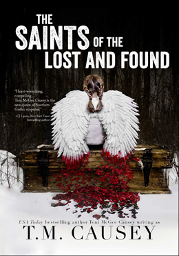
Toni Causey’s The Saints of the Lost and Found is a novel that blends magical realism into a Gothic tradition. And doesn’t this beautiful cover image do the very same in visual format? The book is particularly difficult to categorize, so it’s fitting that the cover image would also confound. I’m happy that the book was given such a striking image because I don’t want the novel to get lost within the weeds of the larger press releases. This is a very special book with a very special cover design.
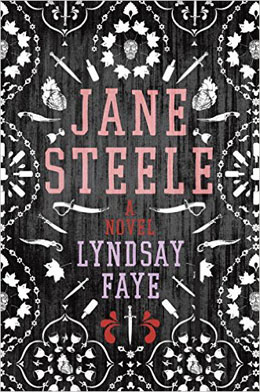
Jane Steele is an homage to Charlotte Bronte’s Jane Eyre, so it is only fitting that the Lyndsay Faye’s novel be given a cover that feels at once both retro and modern. The aged wood effect on this cover probably works better in person, but the wallpaper stencils here still make this a winner when viewed online. At first glance, it seems like a very simple design, but close inspection reveals daggers, skulls, goblets, and even anatomically-correct hearts – all of which fit the tone and subversive nature of the novel perfectly.
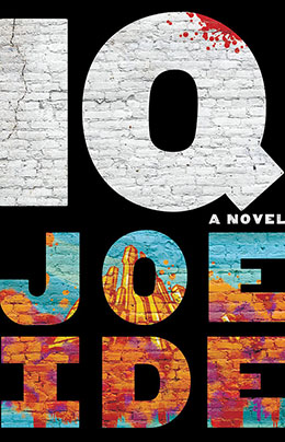
Joe Ide has created something new by combining hip-hop culture with a Sherlock Holmes-inspired tale. The gritty nature of this cover calls to mind inner-city graffiti while the enlarged fonts demand attention be paid to both the important parties here – Joe Ide – the author, and IQ – the character. The vibrant colors are attention-grabbing and also reflect the energy of the writing inside. And that little splash of paint in the upper right – the part that looks like blood splatter – confirms that this is very much a crime novel; but one unlike anything you have read before. I don’t envy the artistic team’s dilemma when faced with designing the cover for the sequel.

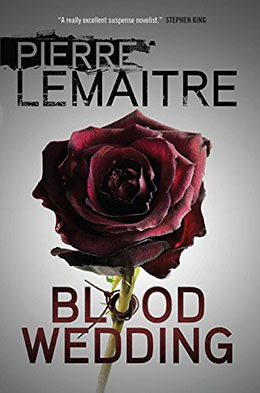
A blurb from Stephen King would surely be enough to cause most readers to pick up Pierre Lemaitre’s Blood Wedding. But look at the gorgeous image. And then look very closely and see the faces that make up not only the outer petals, but also those within. Making the first “o” in Blood into a binding on the flower’s stem continues to echo the ominous feel of this stunner.
From the Booking Desk:
It is clear from my choices that I prefer covers that echo the mood, tone, and style of the novel itself. Anyone can place a nice image and some text on a cover and call it a day; but it takes a true designer – one who understands the genre and the plot within – to make a cover that feel like a visual representation of the author’s ideas. Kudos to these fine folks.


Terrific choices – I hadn’t seek all of these.
Thanks Anthony!