From the Booking Desk:
Yep, it’s another list! This time I am talking about my favorite crime fiction book covers of the year. What I am most excited to say is that not only are these all great covers, the words within live up to the hype generated by their covers. Several of these titles just missed being on the BOLO Books’ Top Reads of 2017 list. So, if you are looking for that unique gift idea this holiday season, perhaps one of these beautiful pieces of artwork will fit the bill – and entertain with a heck of story as an added bonus. Can’t beat that!
(Follow the link under the cover image to read the BOLO Books Review of each selection.)
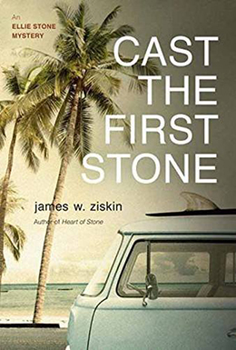
Cast the First Stone by James W. Ziskin
Seventh Street Books has done an amazing job of making sure that James W. Ziskin’s Ellie Stone series is recognizable at just a glance. The last two – including this year’s title – have had a very vintage feel that works beautifully with the series’s historical setting. In Cast the First Stone, Ellie travels to Hollywood and doesn’t this sepia image convey that perfectly? I also really dig the simple touches like right justifying the novel’s title and having the author’s name all in lowercase. Very classy!
__________________________________________________
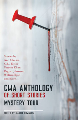
CWA Anthology of Short Stories – Mystery Tour (Review coming soon)
As far a publishers go, Orenda Books gets the closest to nailing cover design with *every* title they handle. This short story collection features crime fiction stories with the theme of travel and/or set in various unique locations. The sideways map with a pushpin dripping blood works perfectly to convey this concept. Also, placing the focus on a pushpin as the central image for a crime collection is so unexpected and yet, perfect.
__________________________________________________
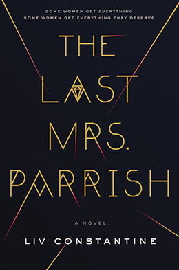
The Last Mrs. Parrish by Liv Constantine
Like a few titles on this list, the digital image of this cover doesn’t quite convey the majesty of the physical object itself. This one features matte grey/black background with gold foil lettering and deep red highlights. The diamond centerpiece works wonderfully with all the sharp angles in the font choice, but also echoes the novel’s themes of marriage and its wealthy characters. And there is just something menacing about those various dagger points dipped in red. Here we also have an example of a tag line that hooks the reader immediately.
__________________________________________________
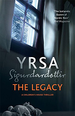
The Legacy by Yrsa Sigurdardottir
This series launch from an Icelandic author is probably the most traditional of my choices this year. I should note, this is the UK cover – and unfortunately the 2018 US cover doesn’t quite have the same appeal. The Legacy starts a series that will feature the “Children’s House,” so the child’s stuffed toy at the bottom clues readers into that immediately. Windows are a common focus in crime fiction covers, but here I think it gets elevated by the angle, vantage point, and the mood lighting. I also particularly like the stylization of the author’s name – both first and last – and placing the focus on that rather than the title. Yrsa is simply that good!
__________________________________________________
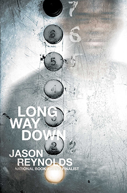
Long Way Down by Jason Reynolds
Another one that has to be seen in person. The foil used for the silver elevator door almost obscures the teenager’s reflection when held at certain angles. Since the entire book takes place as this young man descends to the lobby in an elevator, it’s also fitting that the first floor button happens to be the one illuminated. The distressed metal and disrepair of the button numbers evoke the idea that this will be a story of about a life that is anything but easy.
__________________________________________________
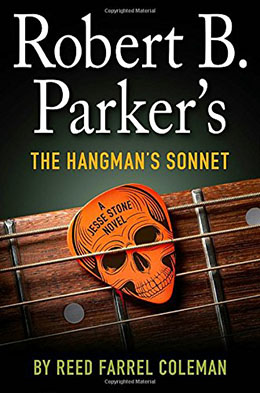
Robert B. Parker’s The Hangman’s Sonnet by Reed Farrel Coleman
Here is the perfect marriage of image and plot. The Hangman’s Sonnet is about the lost song of a folk icon, so what better to reflect that than a guitar. In person, it almost feels like you could strum the strings and pick up that guitar pick. This cover conveys massive amounts of information – the original series author’s name, the current author’s name, the series subtitle, and the book title – all without seeming out of balance. That is no easy feat.
__________________________________________________
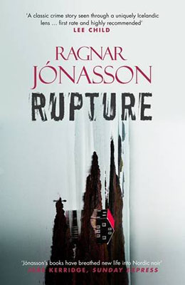
Who would have thought that simply turning an image on its side would take something from what would have still been a strong cover and turns it into something that is almost abstract art. Ragnar’s entire Dark Iceland series, as published by Orenda Books, is easily identified, but I think this is my favorite of the five books. I even did an entire blog post discussing this cover. You can find that HERE.
__________________________________________________
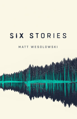
Six Stories by Matt Wesolowski
Another Orenda Books title! And my very favorite cover of the year – and possibly *ever.* This book is about a podcast looking into criminal cold cases. The entire book is a transcript of the radio broadcast. This image of trees reflected in the water perfectly evokes the novel’s setting, but also represent the sound waves as they would appear on an equalizer. How brilliant is that? The off-white coloring, black, and turquoise coloring is also unique and memorable. And notice the subtle changes of the title font. The physical book also plays a bit with texture and gloss. It doesn’t get better than this folks. (Except that Book Two in this series will likely be making next year’s list based on an early view.)
__________________________________________________

Spliced by Jon McGoran (Review coming soon)
This book really has to be held in your hands to appreciate the quality of it. A digital representation just doesn’t reflect what is actually happening here – and it’s not just the cover this time. The whole production of the book makes it a work of art. Most prominently, this is a texture thing. I can’t wait to see what Holiday House does with future books in this series. I suspect it will make for a spectacular collection – so don’t miss out on getting this hardcover now.
__________________________________________________

Unraveling Oliver by Liz Nugent
Very different from the original UK cover – which was also wonderful – this cover conjures the idea of a school portrait of a nerdy, scholarly type individual, but the peeling wallpaper and aged and worn nature of the design portend something darker than what the image alone would signify. Which pretty much sums up Oliver and the book’s theme.

I ordered one of these, just by the cover. Sorry darling, digital all the way here. Instant gratification and all that you know xox
No apologies necessary. Glad you found something of interest.
Oh, these are great covers! And I hadn’t heard of Six Stories, but agree with you on the cover and now look forward to the book too!
Six Stories is far too often overlooked. The concept is original, the execution is exciting. I am so glad that the series is continuing.
Your posts are always so insightful– I’ve learned a lot about cover design from these in particular.
Thanks Neil. My Dad had a very long career as a graphic designer (not of books, alas), but I certainly got my interest in visual elements from him.